Wednesday, 27 April 2011
Friday, 15 April 2011
Final front cover, contents page and double page spread
Above, are the final designs for my music magazine. I have adapted and changed each aspect of my final magazine so that it best fits the genre that i have chosen to base my music magazine on. The final design consists of one front cover, one contents page and one double page spread.
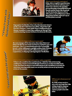
Music magazine double page spread draft copy
After i had analysed and changed my front cover and contents page again, i moved on to design a rough draft of my double page spread. I went back to my research on double page spreads and looked at the layout of them. After this, i decided to start creating my own double page spread, based roughly on a few ideas i had seen in my research. Above is my rough draft of my double page spread, and i still need to change a few aspects of it, for example the layout of the writing and pictures.
Front cover and contents draft copies
I changed and reformed the layout and design of my front cover so that it was a better representation of the music genre i had chosen, and of a real life music magazine. I then moved to create my contents page, and after designing lots of different backgrounds, layout and ideas i finally created a contents page that i felt was similar to my front cover, but was also different enough so that it would attract a potential reader. I realized however that some aspects (for example the pictures) of my contents page would have to be further adapted in order to fit in with the rest of my music magazine.
Music magazine front cover - first draft.
With a rough idea for a masthead, and a few final pictures, i decided to create a draft copy for my front cover. After creating this i analyzed and picked out key points that needed changing and that could be better, i.e. shape and style of text, background picture.
Music magazine photoshoot
For my music magazine i held a photo shoot with a model that i think best represented the genre and style of music that my magazine was trying to show. I took pictures at my school, in the music department, and in the photography department against a white background. After i had taken these pictures i then edited them on the a program called pisca 3. When i was happy with the final outcome of my pictures, picked the ones that best fitted the layout and genre of my music magazine and used them and started to create a front cover, contents page and double page spread. The following are the pictures that i took by following my photoshoot plan.
Music magazine double page spread annotated
Finally i have found two double page spread articles from music magazines on the internet. I have then annotated and highlighted key areas and selling points of the double page spreads and why the magazine has used them.
Friday, 1 April 2011
Music magazine contents pages annotated
Now I have found two contents pages from music magazines on the internet. I have also annotated these contents pages picking out the best bits and the selling points of each contents page, and why the magazine has used them.
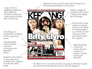
Music magazine front covers annotated
Here I have found on the internet , the front covers from three different music magazines, Kerrang, NME and RollingStone. I have then annotated each front cover and focused on the key selling points of each front cover and why they were used.
Music Magazine Digital Collage
The following is a digital collage of pictures that I have collected, and each picture refers to the music genre and the kind of subject matter that will be present in my music magazine.
Subscribe to:
Comments (Atom)


