Friday, 27 April 2012

Candidate Details and Final Products

Candidate Name: Thomas Cassidy
Candidate Number: 7055
Centre Name: John F Kennedy Catholic School
Centre Number: 17131

Magazine Cover


Poster


Link for my trailer


http://www.youtube.com/watch?v=01blH2S9TMc

Saturday, 7 April 2012

Evaluation Question 3: What have you learned from your audience feedback?


For the feedback on my poster and magazine cover, I used a program called Voki which is a digitally enhanced software used to express opinions through the computer.

Poster - http://www.voki.com/pickup.php?scid=6034577&height=267&width=200

Tuesday, 27 March 2012

Final film trailer

So far we had filmed and edited the first draft of our film trailer. We had uploaded it to Facebook and YouTube in order to receive positive and negative comments concerning our trailer, that including points that were good, and points that we could work on. After this we went back to our trailer and finished the editing for our final film trailer. Here is the film trailer, posted on YouTube, followed by my own analysis of how we filmed and edited our trailer, and why we did it.

http://www.youtube.com/watch?v=01blH2S9TMc


Thursday, 8 March 2012

Film magazine cover

As well as creating a trailer and a poster for our media coursework, we had to produce a magazine cover showing how our film is being presented, advertised and distributed. I looked back at my AS coursework when we designed a magazine cover, and at my magazine cover analysis in order to achieve a professional magazine cover. Here is my magazine cover, followed by my own analysis of how and why I created it.


Wednesday, 22 February 2012

My final film poster

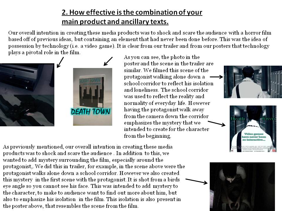
After creating my first draft for my poster, I decided to look back properly at my original sketches, and create a poster based directly of that design. The original sketch had been a boy walking down a corridor at school. This sketch had been the basis for one of the scenes in our trailer, were the protagonist walks down the school corridor to be confronted by the antagonist. I then decided to create a photo shoot that reflected that exact scene. Here is my poster, followed by an analysis of why and how I created my poster.


Thursday, 16 February 2012

Film poster first draft.

After my photo shoot, I choose some of the photos I had taken and started to create my first draft for my film poster. I played around with different ideas based on some of the designs I had sketched in my initial design ideas. Here is one of the first drafts of my poster, followed by how and why I created and designed it.


Monday, 13 February 2012

Feedback from our First Draft

We waited for a while after posting the first draft of our trailer on the internet for people to see it and reply to us with feedback on what was good about the trailer and what we could of done better. Here is some of the feedback we received from people on Facebook and YouTube.


After receiving the above feedback we decided to go back to our editing and try and find a way of extending the music so that is plays throughout the trailer which would keep up the tension, and built suspense during the course of the whole trailer, instead of just certain parts. However, even though this was possible, we decided that it was not necessary as it would mean deleting the scenes with the new reporter, which acted as our voice over. We came to a group decision that the news reporter was a vital part in the film, and that we could not remove it, so we kept the music at the same length as it had originally been.


We received quite a few comments on YouTube about the news reporter and its effectiveness. Some of the feedback suggested that the scenes with the news reporter were unrealistic and unprofessional. After agreeing to work on this criticism, we set about changing the actor who played the news reporter. We had decided that an adult would work better instead of a teenager and we also edited the dialogue for the reporter so that it sounded more professional. By displaying our first draft on the internet we could positively and successfully use the constructive feedback given to us in order to improve our trailer.

We received more feedback from our peers, and reviewed comments made about the colouring of our production logo. Originally the production logo had been red, and we received comments about the improper use of colouring and how it did not relate to the rest of the trailer, which had teal/light blue writing. So we decided to go back to our production logo, and revert the colour to the teal/light blue that we had used throughout our media production. 

Finally, we added one more scene to the end of the trailer, where our protagonist walks down a school corridor. We did this after receiving constructive criticism that the protagonist should be the last scene that the audience views. This is because the whole trailer has built up mystery and suspense about who the character is, so the image of the protagonist walking away will persuade the audience to watch the film to find out more. 


Wednesday, 1 February 2012

Death Town Trailer - First Draft

As a group we had our shooting schedule and we had the initial storyboard of what was going to happen in our trailer. We then had to find the time to fit in filming it. Unfortunately filming took us two weeks instead of the initial one week that we had planned out. After filming we uploaded everything to iMovie, the program that we were going to use for our editing. As a team we sat down and edited our trailer, cutting down scenes and deleting some other scenes entirely. We then set about finding the right music to add into the background of trailer so that it would fit with the films genre, and we also added different editorial effects such as cuts, fades and intertitles which would make out trailer look professional, keeping in line with the conventions of a real film trailer. After we had finished editing our first draft for our trailer, we uploaded it to Youtube and Facebook in order to receive feedback on what we could do better. Here is our first draft;

http://www.youtube.com/watch?v=ul9dtGzfnq4

Wednesday, 4 January 2012

Shooting Schedule

After we had decided on our props, location and costumes, we had to organize a shooting schedule. This would involve deciding how long our filming would take us, where we would have to do it, and what each day of filming would involve. Our shooting schedule was an essential part of planning as it gave us a plan for what we had to do, which made filming much easier.


Friday, 16 December 2011

Props, Location and Costume.


As a group we had the initial idea for our trailer and what was going to happen. We had drawn a story board for our trailer, and also commented on the changes the we have and will make to make the trailer look more professional. Our next step was to organize the logistics of the trailer and how we were going to film it. We started by organizing a table that included the props, locations and costumes that we intended to feature in our film.


Props
Locations
Costume
GAMES CONSOLE – For use in the trailer, to be used as an outlet for the game to be played on and to show the audience how the game is played.

GAMES CONSOLE CONTROLLER – For use in the trailer, to show what the game is played with and to emphasize the importance of the video game in the film.

TELEVISION – For use in the trailer, to show what the video game is being played on and also to emphasize the hypnotising effect of the video game through the visual aspect on a TV.

VIDEO GAME – For use in the trailer, to show the object that the content of the film is based around and highlight the importance of the video game. 

MEDIA SUITE – For use in the trailer and for the magazine cover. I used its white backdrop for the scene with the newsreader because it provided the professional look that I needed to make it seem realistic. I also used it for the photo shoot for the magazine cover because again it provided the image of real photo shoot.

BEDROOM – For use in the trailer, I used a bedroom for the scenes with the main character playing the video game because it gives the audience a background into the main character and it makes the film feel more realistic. As well the scene with the games console controller, the video game going into the games console and the curtains being shut.

SCHOOL CORRIDOR – For use in the trailer and for the film poster. I used this location as it was a long corridor which was good for the main character and the antagonists to meet from either end, which is portrayed in the trailer. I also used this location for so I could achieve an image for the background of my poster.
SUIT AND TIE – For use in the trailer, in the scene with the news reader, to provide an authentic and professional look needed for to make it look realistic.

SMART CLOTHING – For use in the trailer, in the scene with the bullying in the school corridor, to give the impression of being in a school in order to make the film more realistic.

 DARK CASUAL CLOTHING – For use in the trailer, photo shoot and the magazine cover. This is to give the character a dark and mysterious side and make it more realistic for the film.

Thursday, 15 December 2011

Poster and Magazine cover photo shoot.

For my magazine cover and my poster I decided to make a photo shoot with our protagonist so that I could achieve professional looking pictures for my media products. I used a white screen backdrop for these pictures, and took many so that I could find and pick out the good and bad ones. Here are some of the following photos.


Wednesday, 23 November 2011

Initial Design Ideas for Poster and Trailer

After doing my research on posters and film trailers, I decided to start drawing some of my own ideas for my poster and a story board for my trailer. 


For my initial ideas for my poster, I tried to stick with the theme of a game, which was what the film was based on. I started with five rough sketches and annotating each one with reasons behind my idea and what the poster represents. I then choose one of my five sketches and developed it, and choose this sketch eventually to be the main idea for my poster. 


My storyboard for my trailer was our original idea. However after a discussion between myself and my group we and after trying to film some of the harder scenes like scene two and three, we decided we needed to change it. Furthermore, we calculated that all of the scenes would total a time longer than we expected, averaging around two minutes in length, so we had to make some cuts. We removed scene two and three, so it would cut from scene one straight to scene four. We then added some inter text to explain more of the story and break up the scenes. We kept the scene five, however we removed scene six, and added several more quick scenes with sharp cuts in between each one. These new scenes helped expand the length of the trailer appropriately and also showed time passing. We followed this with scene seven, and added two more scenes at the end to finish off the trailer. 

Thursday, 17 November 2011

Film Trailer Analysis

For our final piece of research, I had to look at and analyse other film trailers based on the genre I had chosen. I did this so that I could further my knowledge and understaningd of how film trailers worked and learn the typical conventions of them, especially in horror films.
The three horror films that I choose were:
The Shining
The Exorcism of Emily Rose
Silent Hill


Trailer Analysis
The Shining


  •   Male voice over. Lays out the film with a simple line “I don’t suppose they told you anything in Denver about the tragedy we had up here during the winter” 
  •  Trailer opens with a long shot. Car moving across a country road, desolate.


  •  Mountains in the background. One single road. Immediately gives the impression of isolation and mystery.
  • Long, wide shot of the hotel (castle) with mountains as a backdrop and surrounded by trees. Reinforces the idea of an isolated place.


  •  Voice over continues to tell the story with no apparent meaning.
  •  Interior shots of the hotel. Empty and abandoned. Seemingly harmless but adds mystery and suspicion.
  •  Voice over delivers the final line “killed his family with an axe”. Intense and disturbing. However it attracts the viewer’s attention and intrigues them into what why the tragedy happened


  • The music builds to a crescendo. High pitched screeching sound. Makes the viewer uncomfortable and suspicious.
  • Crescendo ends in sync with the final sentence. At the same time a deranged man wielding an axe smashes a door.
  •  So far the colours in the trailer have been bland and dull, showing no life or vibrancy, which again reinforces the idea of isolation.
  •  Quick editing between scenes shows the antagonist and his family.


  •  This gives background and pretence to the story, revealing a little bit more about the plot.
  •  Also adds a bit more humanity to the trailer, for instance, it finishes with the long, dark, mysterious scenes of the castle and its surroundings.
  •  More colour and vibrancy is added.


  •  Single second shot of the son screaming. Makes it more intense and brings back that feeling of mystery.
  • The editing between the clips, especially the vibrant ones in comparison to the other long shots of remote areas, include a lot of fades. This adds tension to the trailer.
  •  The sound is creepy and off putting, keeps the viewer on edge and makes them anxious.
  •  The following editing is jumpy which makes it more intense and adds to the tension and horror of the film.
  •  Violins build suspense and quick cuts add to that. More action starts happening.
  •  The following shots are dark and mysterious. They reveal more about the plot and have confirmed the viewer’s idea that something bad is going to happen.
  •  There are a lot of cuts that are out of context to the beginning and middle of the trailer. This is purposely done to confuse the viewer and make them feel uncomfortable, adding to the intensity of the trailer. 


The Exorcism of Emily Rose
·        
  • Trailer starts with a shot of a lonely house in the middle of nowhere. Completely white with snow. This shows isolation and fear, and the blanket of white creates tension and the mystery of the film.


  • Low shot of the man up in the window; this builds tension and gives the character mystery.

  • Editing of “Based on a true story” does two things, it intrigues the viewer as well as scares them. It makes the film more realistic


  • Following writing sets the scene and describes the plot. Background information on characters.
  • Continuation of the desolate, bleak colours of white and grey which plays on the emotion of fear and shows isolation.
  • The scene with the tape and the girl screaming play on the fear on the viewer, making them anxious but interested.
  • More close up shots of the man show that he is disturbed or troubled by certain events that are to become clear in the film. Gives the viewer incentive to keep watching.
  • A few short and sharp cuts add tension to the trailer.
  • The scene where the bed moves with the women in it sets the scene, adds mystery as to who is behind it and plays on the viewers fear.
  • It gives the viewer a teaser of what is to come.
  • Further scenes in and outside the courtroom add further background information to an ever revealing plot.
  • More short scenes with dramatic music and dialogue, adds more information but also builds up tension and fear of the horror film.
  • Dialogue like “there are no injections against the Devil” are powerful and revealing, furthermore, the close up shot as the man delivers the line shows the emotion in his face and body language, which shows fear.
  • Light choral music creates tension and mystery. The theme of desolate and bleak colour is continued. Dark prison cell, dark church, dark and mysterious hospital room.
  • Following scenes contain dramatic and scary images of evil and possession, revealing even more about the film and again playing on the fears of the viewer, but still keeps them interested.


  • More short sharp cuts in editing. Background music also experiences cuts and peaks with screeching.
  • Towards the end of the trailer there are a lot of quick fade in, fade out cuts. This is to show that the pace of the film/trailer has picked and that is in full flow. Shows action and drama.
  • Continue with scary flashing scenes, playing on the viewers fear.
  • The trailer reaches the climax of the action after the crucial dialogue “It has begun”. The dialogue itself shows that everything is about to happen. Plays on fear. Quicker sharp cuts, lots of lights and flashing images create more tension and fear.
  • The trailer ends with the light choral music and the aftermath of the horrific scenes.


Silent Hill
  • Two separate shots of a woman and her daughter. Shows the audience a picturesque image of a happy family a supposed happy family. The image contains a long shot of the pair under a tree in the sun.
  • The voice over is by the female mother character, describing the events that her daughter gets up to while asleep. This gives the audience a hook, something that intrigues them to continue to watch the trailer and draws them into the storyline.

  • The music in the background adds a feel of intensity and interest. It plays the story out in the beginning of the trailer. The voice over gives more of the storyline away, intriguing the audience more.
  • There are continuous shots, with sharp cuts between each one of a car driving along a long stretch of road at night. This again gives the audience a feeling of intensity and gives the storyline as well as the trailer a destination. There is brief text saying ‘Toluca County, West Virginia’ which gives the film a setting.
  • A brief scene inside the car in which the mother and daughter are still driving towards their destination. There is low lighting due to the fact it is night, but it also gives the scene an edge of creepiness that intrigues the audience. This is followed by a shot of the radio crackling and the music stopping. This again gives the audience a hook, which makes them understand that something strange is about to happen and hopefully any of their questions about the beginning of the trailer will be answered.

  • The following scene still only involves the original two characters, the mother and daughter. This makes the audience question what their background is and how they have ended up in this situation, a question that would only be answered by watching the film.
  • The next few scenes contain only the mother. This makes the audience more interested in the daughter and what has happened to her.
 

  • Also in the next few scenes, there a several different shots (long shots, close ups and profile shots) that are of the mother in a completely changed setting. It has gone from darkness to and abandoned road in light, covered in ash.
  • Throughout these scenes there is still silence and no added non digetic sound. This adds more suspense to the scene, making it more interesting for the viewer to watch.
  • There is a pan of the camera to a billboard that has the name of the film on it. The name of film obviously has a vital part in the plot of the movie. As the pan takes place, there is a sharp high pitched crescendo of music which stops as there is a cut to black, followed by the mother shouting her daughter’s name in the darkness. This adds creepiness to the film and puts the audience on edge, as they have no idea about what is to happen next. The crescendo music then cut to black is classic horror movie convention.

  • There are then a few very effective sharp cuts that show time passing and the mother walking down an apparently abandoned road.
  • There have been three major changes of colour throughout the trailer. It has gone from a happy yellow and orange at the beginning, to a dark black, which is because of the night, but also shows the mystery and intensity of what is to happen next. Then the final change is to a bleak grey and white, which creates tension and mystery.
  • The voice over is dialogue taken from the film that continues to tell the story and give details away about the plot. The voice over is of the mother again, and is put over scenes of her desperate struggle to find her daughter. Another character is introduced and that gives the impression of a father figure. 
  • More text that displays ‘what was once an ordinary town’, which gives more away about the plot and the setting. The mix of the bleak and abandoned town coloured in grey and white means the audience can start putting together pieces of the plot.


  • Another voice over is added of a deep male voice, which completely changes the pace of the film. The scenes that play alongside the voice over are made up of quick cuts and shots of a town ravaged by disaster.
  •  There is more text, adding more to the plot, and making the trailer more mysterious keeping the audience on edge and making them want to find out more.
  • Following scenes are made up of the mothers search for her daughter through the town. To keep the viewer interesting and wanting to see more, there are quick cuts with high pitched choral music, followed by long shots of the town in silence.
  • More text is added, over fast paced music the builds higher into a crescendo. The text proclaiming exactly what the viewer feels, ‘mysteries without answers’.
  • There is the continuation of black and white colour, which not only adds to the tension and anxiety of the viewer, but brings back the suspense and mystery. 
  • The father figure comes back into the trailer, proclaiming that the woman is his wife. This gives the viewer the ability to piece together some idea of the family.
  • There are then quick cuts between the mother and her struggle to find her daughter, and her daughter looking possessed. This adds suspense to film, and his further backed by the high pitched screeching sound in the background.
  • The audience is then given another piece of text, and a loud wailing sound begins in the background. This is done to build up tension in the audience.
  • This is followed with quick cuts of people fleeing in terror and dialogue of scared and anxious characters.
  •  Over the course of the last few scenes, the colouring of the trailer has got darker and darker, and the shots of the characters have become more obscure. This is to put the audience on edge and keep them in suspense. It is a convention of horror that is used to frighten and put the viewer on edge.

  •  The idea of the darkness is continued in the next scenes, after it cuts from scene to scene of the mother in some sort of hell. This puts a completely new spin on the trailer, and essentially throws the audience off balance as it lays out the rest of the plot.
  • This is continued by disturbing scenes that show content of the films plot. Intriguing the reader on wanting to find out the truth behind the film. The music in the background is also creepy and adds to the suspense of the film.
  • The scenes of the mother in this hell get longer and more in depth, revealing more about the plot and interesting the audience more, creating tension. This is reinforced by the music building into a slow crescendo. The crescendo ends with a cut to a black screen. This again adds to the suspense and continues to intrigue the viewer.
  • Finally there are 10 scenes that are effectively cut in time with a non digetic heart beat in the background. The scenes show the mother still in her struggle to find the daughter and the hell that surrounds her. Therefore the plot and direction of the film have been given to the audience so that they can try and predict what happens next.